Showing posts with label design. Show all posts

8.07.2007

Solving a better problem

I recently bought gift cards for a project at work. I don't typically buy gift cards, so it had been a while. But in case you too prefer more tangible presents, let me send you a transmission from the world of gift cards: Things are getting crazy over here!

First, a brief summary of why people DO buy gift cards. They don't know the person that well. They don't feel confident in their ability to find the right gift. They imagine the recipient would prefer to do their own shopping. They have a very set budget. Gift cards are convenient and "you can't go wrong."

Next, a brief summary of why people DON'T buy gift cards. They are impersonal. They ask the recipient to do the work of shopping. They are the equivalent of handing someone cash. They say exactly how much you spent. They seem generic and trivial. They are "a cop-out."

Regardless, sales of gift cards are rising each year, and so I have to imagine shoppers are weighing the pros favorably against the cons. But some of those cons are still keeping shoppers like me away, so I think there's room for improvement.

But hold the phone. I said improvement, not meaningless, over-the-top embellishment. Folks, the gift cards I purchased were from Woodfield Mall, an upscale shopping center in the Chicago suburbs. Each card came with six (6) items.
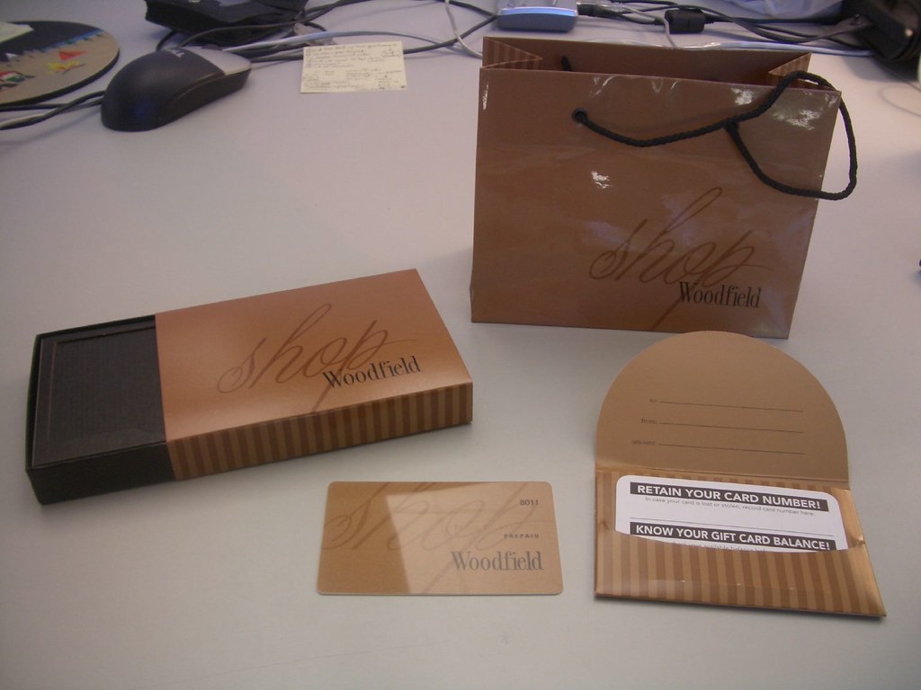

You've got your card, you've got your note, you've got your envelope, you've got your box, your sleeve, and your bag. Card goes in envelope with note, envelope goes in box, box slides into sleeve, and sleeve drops into bag. Can we say, overpackaged?

Now, I think I know what the designers of the Woodfield Mall gift card extravaganza were thinking. They probably had research which said, "30% of our shoppers agree that gift cards are not an adequate gift." So they did the first thing that came to mind: they dressed it up. Made it fancier. Now it looks more like jewelry, or chocolates. There are at least three moments of surprise in this experience - opening the bag, opening the box, and opening the envelope. I'd even venture to guess that when someone finally gets to the card inside, they're a bit let down. "What's this? Ooh, what's this? Ooooh, now what's this? Oh, a gift card."

But even if that recipient is pleased as punch to get a gift card to a mall, I'm not sure this redesign has made anyone a born-again gift card believer. Because I feel they have solved the wrong problem.

They went from a generic problem (gift cards aren't good enough) to a generic solution (let's make them seem better). But let's try digging a little deeper, shall we? Why aren't they good enough?

1. Because they are impersonal. There is nothing about the gift card, save your choice of store, that personalizes the present. He's a sports nut? Let's get him a gift card to Foot Locker! But that was your only real "decision," and it's not exactly "thoughtful."

So, what are ways of making gift cards more personal? The store could print your name and a note right onto the card. How about a note in your handwriting? How about your picture on the card? Better yet, what if you could bring in an old photo of you and the recipient, and the store could screen the photo onto the back of the card? Now that card is a keepsake for his wallet!

Or maybe the store offers gift cards in ten designs, so you can pick the style he'll like best. Maybe you could design your own card? Choose pictures of items he might want, to suggest what he could buy with the card? And once he's chosen the gift, how about a personal follow-up? Maybe the card allows him to enter a photo booth in the store, take a picture of himself with the item, and send it to you?

The point is, surely stores can dream up ways of making the card reflect the giver, the recipient, or both.

2. Because they are trivial. It's just a piece of plastic, after all, and once he cashes it in, the experience is over. Sure, now he has an actual gift, but what role did the card play? It sat in his wallet. It's nothing more than a representation of money. Meh.

So, what are ways of making gift cards meaningful? Useful beyond their primary function? Able to be priced at higher than their dollar value? Well, maybe the gift card isn't a card. Maybe it's a vase. The person receives the vase, brings it to the flower shop, and gets a free bouquet. Or the gift card is a picture frame. She brings it to Sears Portrait Studio for a free session.

Furthermore, if you boil down the function of a gift card, its purpose is to represent a gift until someone actually gets it. Maybe the gift card is a wrapped, empty box? A shopping bag, which you bring to the store and fill? A scanner, which you use to zap the item that you want, a la wedding registries? Stores should think about how to make that gift card work a little harder, so that it creates value beyond its cash equivalent.

3. Because the money thing is awkward. This one is tough. You don't necessarily want the person to know right away how much you've spent on them, yet you want them to receive that amount in the store.

So, what are some ways of making gift card values less awkward? Well, maybe we could make the dollar amount less hush-hush. More explicit and interesting. I know that in Jewish tradition, checks are often written in multiples of 18, which is considered lucky. For a wedding, you might give a check for $72. Maybe we could make the dollar amounts totally flexible, to reflect something similarly cultural.

Or perhaps the money could reflect the occasion? My birthday is January 10th. I'd sure love a gift card for $110. Or even just $10, where the card had a little calendar with January 10th circled. Birthday gift cards. Stores could also keep the dollar amount hidden, until you get to the store and find out what you've got. Now you have to come in! Ooh, what if it was a lottery? All gift cards cost $20, and yours has a value of at least $20, but it might be a lucky $100 winner!

---

Retailers love gift cards for various reasons. Pay us now, take the merchandise later; try our store for the first time; chances are you'll spend more than the value of the card. So if it's important enough, retailers should be looking for ways to optimize this product.

My point is that there are plenty of ideas to be found, when you think about the problem in a more specific, user-centered way. Instead of saying gift cards should look nicer, get to more tangible goals. In this case, gift cards should be more personal, more meaningful and less awkward. These are quite simply more interesting problems to solve.

However, dear shopper, at the end of the day, you're still giving someone the equivalent of cash. My final suggestion: why don't you try picking out an actual gift?

3.25.2007

Repetition, repetition, repetition

Q: How many sweaters does it take to sell one sweater?

A: Apparently, more and more.

Confused? Read on.

---

I recently visited New York City and, like a good curious shopper, spent some time in stores. It's all for you, people.

So there's this new store called Uniqlo. It opened its US flagship in Soho last fall. Uniqlo has been hailed as "the Gap of Japan" for selling basic, mainstream, simple - all right, boring - clothing. But that's okay; boring clothing at reasonable prices has sold well in Japan.

However, Uniqlo has been challenged to translate its retail offering into other cultures. A first attempt at the UK market failed when big, splashy store openings were met with confusion. Now, Uniqlo is focused on bridging the culture gap, by understanding the mind of the fickle US consumer, while also maintaining a subtly Japanese aesthetic. They've set some lofty goals with that one.

When I visited the store, I had a slightly different observation. For me it was less of an American-Japanese gap they needed to bridge, and more of an Old Japan-New Japan gap that needed balancing. I saw spare Japanese discipline coupled with hip Japanese pop culture. The interplay between modern and traditional was fascinating, if not entirely cohesive. Most interestingly, the traditional was actually more in tune with the trends of American retail.


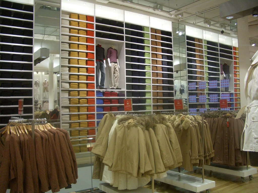
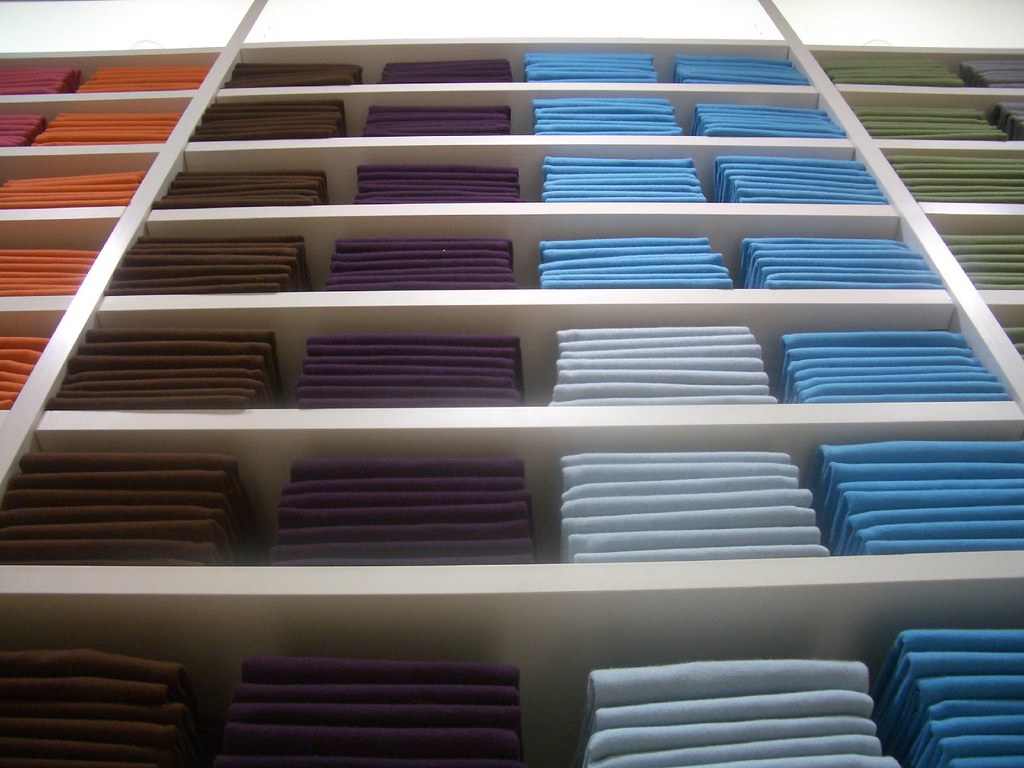
The store is 80% minimalist. The clothes are unbranded and consist mainly of plain, solid colors. Everything is neatly organized and placed on a giant three-dimensional grid. The whole environment is sparse and geometric. It feels vaguely Asian. It feels kinda rigid. It doesn't feel like clothing, and it doesn't exactly inspire me to grab five tops and jump into a dressing room. And yet, there's something intriguing about it.


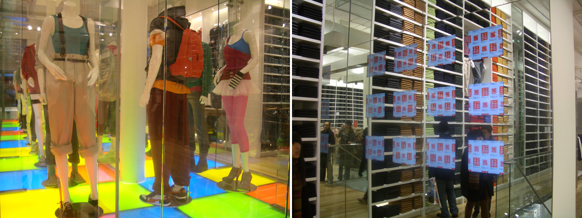
But the other 20% of the store is sensational. Flashy mannequins are decked out in Japanese street fashion, spinning in a disco-hipster aquarium. Flat-panel televisions, mounted flush with mirrored walls, create an eerie, futuristic vibe. It suggests fast-paced youth culture in Tokyo, like the club scene in Babel or the karaoke in Lost in Translation. It feels uber hip. It also feels kinda lonely. It reminds me of the isolation of technology.

Now ultimately, I believe that Americans are hungry for a dose of non-American culture. And saying "I got this at Uniqlo" will give New Yorkers their weekly dose of cool. So the flagship should do very well, and it has so far. But while J-Pop is a fad here in the States, the design elements of traditional Japan are a trend. Know the difference? Fads come and go. Trends are indicative of longer-term changes afoot.

And one of the biggest retail trends I see today is simply, repetition. Why? We are busy, and our attention spans are short. Show us something once, and we might sense it with peripheral vision. Show us something twice, and we recognize it from before. Something triggers our brain to remember it. Show it to us again, and we might actually process it. Show it to us so many times, that it becomes part of something bigger? Now we really get it.

Here's an example. You know how people complain about the grocery store having 40 kinds of ketchup? It probably doesn't have 40 kinds. It might have 15 kinds, but 40 facings. This is because stores give top sellers multiple spots on the shelf. Let's face it, a ketchup bottle is only so big. It can't grab your attention on its own. But an army of ketchup bottles? You are guaranteed to see at least one of them.

Another example. I've seen ads plastered onto el cars in Chicago, and on bus stops in New York. The single ad may be a well-designed, fully complete, standalone poster. But there are three of them in a row. I've learned to ignore most commuter advertising, but triple-vision ads? It's odd and it grabs your attention.


You may be saying to yourself, "But repetition is so obvious. It's the oldest trick in the book." That may be true, but it wasn't always necessary to repeat. Think about it: in the past, stores might have only needed one can of soup to sell, well, one can of soup. Now, apparently, they need two. Repetition has gone from a bonus to a requirement.


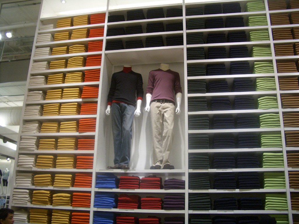
And what Uniqlo has done is take repetition to the next level. The store uses the product to create an enormous wall of color, much bigger and more impactful than any single sweater. When you stand across the room, you sense the pattern and the scale. When you get closer, you recognize the individual items. When you unfold one of the 6 sweaters that are actually within your reach, you feel like you're taking a piece of the Great Wall of China. It's special, because it's part of a much bigger entity.

If retail is a game of attention, this billboard effect is the newest way to win. And so for me, it all came together. Uniqlo may not be in vogue forever, because nobody knows how long Japanese culture will be cool to Americans. But the principles behind Uniqlo's retail exhibition are right on trend. They are actually more in sync with the most basic form of retail out there - the supermarket. Uniqlo might not feel like other clothing stores, but it sure does feel efficient. Packed and organized like the best cereal aisle.

---

The answer, by the way? Well, it looks like there are about 12 stacks of 6 sweaters above each eye-level section. So, by my calculations, 72.

10.17.2006

Wine for smarties

Tell me, friends, do you enjoy a good glass of wine?

Surely you must. Who doesn't these days? Because wine is hot. Wine is the new champagne, the new beer, the new dinner table conversation. Wine is the latest product category to become massclusive - elite yet widely available. First there was Two-Buck Chuck, then the movie Sideways, then we all had wine tasting parties and before you knew it, Business Week had hired a freaking wine columnist. All bets are off; wine is here to stay.

But as vino finagles its way into everyday culture, I'm bothered by a vastly overlooked truth: interest has far outpaced understanding. I'm talking about a specific conversation. It's an exchange I've heard so many times, I'm willing to bet you've heard it too. This is how it goes:

"Hey, this wine you brought is great."

"Thanks. Yeah, I like merlot."

"Me too. Merlot is good. (pause, switch to whisper) You know what's funny? I don't know anything about wine. So you know what I do - (glance around the room) - I choose based on the label!"

"Me too! I go by the label! I just pick one I like! Oh my gosh, I hope nobody hears us. We are such losers!"

Am I right? You have heard it, haven't you? This conversation is so commonplace, it's driving me crazy. For a couple of reasons.

Number one, it's perfectly normal to choose a product by its packaging. How do you think we choose almost every other product? Surely, we don't refine our taste for macaroni and cheese. We don't subscribe to Mac 'n Cheese Monthly or take summer tours of mac 'n cheeseries. We simply look at the box, like what we see, and buy it. No big deal. Folks, the packaging industry is not going anywhere, because for all the websites, advertising and product education in the world, something like 85% of purchase decisions are still made in the store.

Yet wine is held to such high standards, and expectations are so elevated, that to choose wine by the label seems somehow pedestrian. It's as if by liking a nice font or colorful graphic, we are just not "getting it." I am here to say that it's okay to choose by label. For most people, label is as good an indicator as any.

But that leads me to my other gripe. For all the fuss over wine, we are not given a whole lot of help when it comes to choosing "intelligently" in the store. Now surely, one can subscribe to Wine Spectator. One can buy any of the 206,083 wine-related books on Amazon. But honestly, how much work does it take? Someone should be making it easier for us to shop this increasingly complex product.

---

So here's my situation. I attend a fair amount of dinner parties. I'm tired of grabbing the same old Yellowtail from the corner liquor store. I'd like to stock up on wine that is unique, tasty and will impress my friends. Where do I go?

My fellow Chicagoans all point me to the same place: Sam's Wine and Spirits. Sam's is supposed to be the store that brings a wide variety of good wine to the masses. People say the store is huge, the variety is outstanding, and the staff are knowledgeable. So I make the trip.

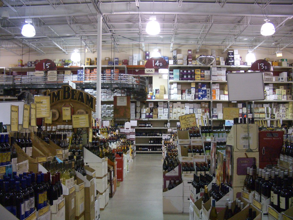
And my friends are correct - Sam's is huge. It's an absolutely enormous warehouse. My immediate reaction is to feel very small, and very overwhelmed. But the concrete floors, wooden pallets and utility ladders remove any air of exclusivity, which is good. Okay, where to begin? I grab a small cart and start wandering.

It takes me about ten seconds to realize that the products are not organized the way I'd expect. Now I may or may not be a typical wine consumer, but here's my decision tree: color (red or white), then style (riesling or chardonnay or pinot grigio), then label (is it unique? does it have a fun name?), then price (preferably under $10). That's how I understand wine, so that's how I'd like to shop it. But 30 seconds in, I'm utterly confused. I pass a white, then a red, then another white. Color is obviously no help. I start looking for styles, but here's one pinot grigio, with no others in sight. How about price? The bottles in front of me are $9, then $90, then $19. Finally, I look up and notice the signs. Guess how the aisles are organized?

They are organized by region. Region of the world, and sometimes region of the country within the world. Now I hate to sound like a shlemiel, but this is a framework that demands some prior knowledge. A first-timer simply cannot shop by region. I tried! I like France, as far as countries go, so I start to look in the France section. Not so fast - that section is further divided into Alsace, Bordeaux, Provence, etc. Great.

I try to use my existing framework. I ask a salesperson if they have any riesling, already feeling a little silly. The guy says, "Sure. Are you looking for French, German or Italian riesling?" The answer, of course, is I don't know.

So I arbitrarily choose German. What the hey, my car is German, might as well give German a try. Once I enter the impossibly tall aisle, an employee asks if I need any help. "Sure," I say, "I'm looking for riesling." But there is no riesling section, and so he starts walking up and down the aisle, bringing me bottles to inspect. At this point, all I care about is price and label. But since the price tags are on the shelves, not the bottles, I take each bottle and walk back to wherever he found it, in an attempt to check its price. This is both inefficient and embarassing, as I don't have the heart to tell him I'm only buying $10-or-less bottles. So I indulge him for a few minutes, chasing him around and checking price tags behind his back. It was, in short, a mess.

In the end, I found 5 bottles of wine that fit my specifications. All were white. Two rieslings, two pinot grigios and a gewurztraminer (all types I know I like). All had unique labels, and one had a funny name. All were under $10. I was pleased with my choices, but it took me half an hour to find them. What regions were they from? I still don't know.

---

Some people might shop wine by color-style-price; others might go price-style-label or just label-price. Surely some people shop by region, and appreciate that Sam's gives their framework top priority. But I just don't think that region, for most people, is the first decision they want to make.

Now region can become primary, and after shopping at Sam's long enough, it probably will. Region is interesting because it's an educating framework. You try a wine from Greece, you like it, you go back to the Greece section, and one day you realize that you are partial to Greek wines. Region helps you form a "wine identity," if you will. But region should not be the first decision point in this enormous store's navigational hierarchy. It is far too complex for most people. Not that I don't enjoy learning about regions - I just think it needs to come farther down the chain of choices.

So here's my ideal wine warehouse shopping trip. First choice: color. I head to the whites section. Second choice: style. I head for the rieslings. Third choice: price. I browse the $10-and-under section. Last choice: all my subjective final decision-makers, such as label, flavors, region, age and vintage. That's when I'm open to suggestions; that's where I want to be educated. Not beforehand.

I'm aware that a lot of Sam's shoppers would be upset. Having become acclimated to shopping by region, they would surely throw their arms up in frustration. "This was the only place where I could always find my Chilean wines!"

But they could still find their Chilean wines. They'd just be called out at the product level. And more people might discover them this way, because if they knew they liked red wine, and enjoyed cabernet sauvignon, and wanted to spend $10-20, and thought the "duo" label looked cool, and thought a dark, meaty, juicy wine sounded up their alley, they could pick this one, and discover it was from Chile. If they liked it, they could look for more wines from Chile. Or more dark reds. Or more from the brand, Alto de Casablanca.

Sam's is doing a lot of difficult things well. It's advancing the industry by democratically sharing great information through its website, blog, educational seminars and tastings. People enjoy getting lost in its aisles as they scan labels, explore regions and learn about flavors. Shoppers at Sam's taste, try and return. But I believe even more people would feel confident about their purchases, rather than ashamed at their lack of knowledge, if the store's basic organizing framework were as inclusive as its warehouse-style vibe.

10.08.2006

She is the store

Excuse me miss, but are you knitting?

If you are one of thousands of young women who has heard that question recently, you know that knitting isn't just for grandmas anymore. Knitting was declared "the new yoga" at the start of the millennium, and more and more young people are taking up this calming, creative craft.

Everywhere you look, the knitting wave continues to grow. My trendsetting city has yarn shops in practically every neighborhood, and when my friend and I started a local knitting group last year, we had no idea it would grow to over 250 members.

But I find a slight gap between the hip chick making a scarf on the train, and the place where she buys her yarn. Many knitting stores are, for lack of a better word, uncool. They display thick cabled sweaters and pea-green shawls. They are run by disconnected women who make up in yarn skills what they lack in people skills. They have punny names like Knitche, Have Ewe Any Wool? and We'll Keep You In Stitches. It's a decidedly frumpy retail landscape.

However, a few knitting stores have started to get it, and I'd like to highlight one that rises to the top. It's a small boutique near my house, and it's called Nina. "Nina," you ask, "what kind of a name is that?"

Well, the best way to describe Nina is through a parallel example. The Apple Store is often praised in this way: "It looks like the whole store was designed by one person." Friends, meet Nina.

Nina is a store designed by one woman. While I don't know this woman personally, after spending some time in her shop, I feel as though I've been to her home, met her family, looked through her closet and heard her life story. I feel like I know her inside and out. This is because she seems to have touched each nook and cranny, made each careful decision and essentially put herself into every element of the space.

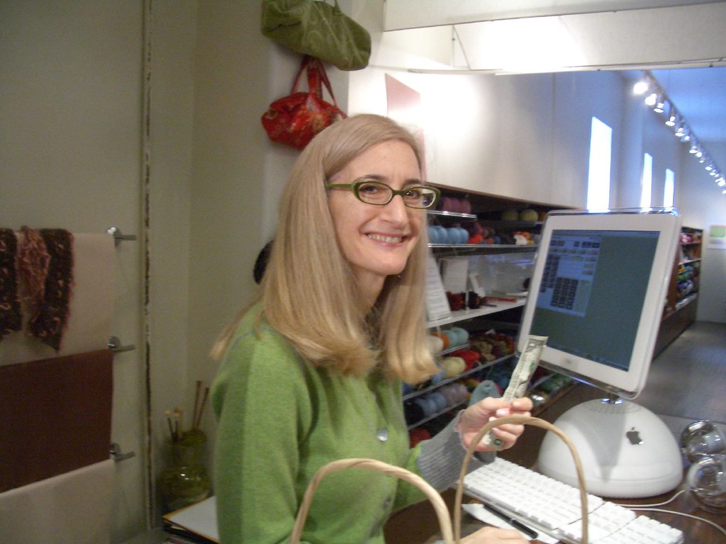
Nina's personal style is unique and enviable. Her often-homeknit outfits simultaneously defy and create trends - sweaters with flared sleeves and intricate color patterns, matching wristwarmers and wraps. And Nina seems almost ageless. She often wears her long hair down. Her modern glasses are green. She's soft-spoken and sweet and yet, at the same time, very very cool.

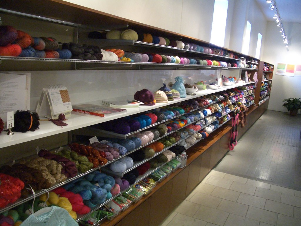
And this personal style spills out into every detail of the space. Oversized needles frame the front window, a space made warm by a modern couch and enormous low-hanging lamp. Nina herself is small, and these proportions make you feel a bit like a child, or perhaps Alice in Wonderland. Blond tile floors practically match Nina's own hair. The clean walls and minimal wood shelves make each brightly colored ball of yarn pop that much more. And each product itself seems hand-selected, each blue the newest shade, each alpaca yarn the softest blend. From the lovely bamboo needles, to the pristine white iMac, to the graphically elegant shopping bags, every inch of Nina looks like, well, Nina.

The coherency found in this store is remarkable; everywhere you look, you see the vision of one person. But how might this translate to the larger world? Knitting retail is fragmented and inadequate. Could Nina expand her empire? Could she open even one more store?

My answer is, I hope not. In an industry where the product is so personal, the decision so tied to creative expression, having the owner's physical presence can make or break all the good design in the world. If Nina herself weren't there, I would have said "Nice shop," bought some yarn, and left. I think that without Nina at the counter to say hello, advise on gauging and suggest projects, as well as knit and model her own creations, the cool vibe would die down pretty quickly.

Then, to turn the issue around, could larger chains ever be like Nina? We've all heard of "brand nazis" and design language so tight no air gets through. Some stores come close to this level of cohesion, mostly brand spaces like Apple and Nike. But standards become more malleable with each successive person who uses them, and rules are bent, then broken, with each new store. Furthermore, you can't have your company's top retail designer also work the register at all your stores. Sadly, the laws of physics won't allow it.

Now admittedly, I don't want to share Nina. I want her to keep her store in my neighborhood and sell her cool yarn to me. She's helped knitting become chic, and I'm grateful.

But I also think if Nina wanted to expand her horizons, new stores wouldn't be her best bet. Perhaps she should open a retail consulting business, helping people find their own personal style and translating it into their store designs. She may be good at knitting, but she's good at retail too.

And so, Nina's shop remains unique. I will continue to shop there for the product, but also for the person. You can take the store out of Nina, but don't you dare take Nina out of her store.

6.15.2006

Easy as 1-2-3-4-5-6-7-8-9


Home Depot is ridiculously full of information. Product catalogs, how-to guides and educational signage fill every inch of non-product space. This is a store that's already suffering from major clutteritis.

Maybe they figure their shopper is just a true D.I.Y.er that hates to ask for help. But I for one need serious help in Home Depot. And somehow I know that a sign isn't going to be able to answer my questions. So I tend to be in the "less signs, more people" camp.

I can find nothing better to describe the over-signed, over-bannered, over-helpful-hinted environment than their poster series. It's called "Easy As 1-2-3." This one has not 3, but 9 steps. How to install a ceiling fan in, yes, 9 steps. Not 3! That is not easy as 1-2-3! That is fully six more steps than three! How about creating a planting bed in six steps! Should I stand there and write down the steps? Or should I buy the book on planting beds? There is no in-between.

I'm not sure if this poster is meant to encourage me to install my own ceiling fan ("Wow, I can do this myself, even if it takes three days!") or to frighten me into hiring Home Depot to install it for me ("Whoa, this looks impossible!") What I do know is that "Easy as 1-2-3" is almost never the case with a home improvement project, and that their series has a very misleading name.

Home Depot has the right idea when they position home improvement as easy. And the whole "You can do it, we can help" slogan is dead-on. But they shouldn't blatantly overpromise, either. Some projects require a few more steps, and a little more help, than a poster can really convey.

6.09.2006

Reinvention through retail


How does an old brand reinvent itself?

If you are Moleskine, maker of simple black notebooks, it might not be easy. The story goes that these legendary notebooks were used by European artists and thinkers for the past two centuries - but that one day, the producer stopped making them. The factory closed its shutters, and a tradition died. Then, in 1998, a small Milanese publisher brought Moleskine back.

Now it's 2006, and Moleskine has crept back into the public
consciousness. Or at least the consciousness of the creative class
circles in which I hang. The notebooks are seen at conferences and on the train, often with Post-Its and magazine articles sticking out. They hold notes, sketches and thoughts. Their story is about the creative potential that a blank notebook holds. And I think they have used retail quite effectively to tell that story.

First, they have gotten around the obvious barrier: if you sell a bunch of black notebooks that all look the same, how do you announce a diverse product line? You could start with color. Moleskine uses brightly colored paper strips to package each product. And who knew there were so many types of people taking notes? There is a unique color for music notebooks, Japanese notebooks, lined, blank, squared, sketch, address, diary, reporter and storyboard notebooks. A lot of colors, yes. But if you are buying one for your brother the music student, you know to go straight for the aqua.

This makes the display simultaneously lively and clean. No crazy retail devices are needed - just a solid white stand. I know color-coding is an in-store trend, and that there's always this backlash reaction of, "It adds to the clutter." But Moleskine has managed to use up to 10 colors at retail, and I see no cause for alarm.

Next, they have presented a teaser. The display has one basic
claim: "The legendary notebook of Hemingway, Picasso, Chatwin." I don't know how to draw, I've never heard of Chatwin, but the same notebook that famous writers and artists used? It's a hopelessly romantic notion of great respect through pen and paper. I read that simple claim and feel inspired.

And most importantly, Moleskine has refrained from falling into the information overload trap. They don't announce the acid-free paper, they don't explain the French origins of the cahier, and they don't show the artists' doodles. All these details unfold as you open your notebook, and then later when you visit the website.

In truth, this is singular, if for no other reason than the fact that Moleskine seems to have considered retail from the beginning. They weren't going to mess with a classic product, but this time around, it needed a refresh. Perhaps a simple, compelling retail presence was their best chance to start anew. I don't know what their marketing budget entails, but I somehow doubt they are taking out ads in The New Yorker and 30-second spots at primetime. Like the discreet black notebook itself, Moleskine is quietly making a comeback through, basically, just retail.

5.31.2006

The name game

Barney's Co-Op has a really good thing going. The store is a younger, hipper, ever-so-slightly cheaper version of Barney's. You could call it aspirational Barney's - grooming the next generation* to someday trade up to the real thing.

*Note: If I had to describe who shops at Barney's Co-Op, I would name them Yupsters: one part yuppy (lots of money), one part hipster (eclectic and detached).

And the Co-Op stores are beautiful - industrial cement floors mixed with mirrorball decor and well-positioned accessories. I especially enjoy the rubber bench - a ton of tubes held together with seatbelts that manages to walk the fine line between found garbage and designer art.

But the best thing about the Co-Op right now is their use of names. Covering their walls are small, brightly colored portraits of people. Each one has a unique painted silhouette and one sentence that starts with a name. "Ron thinks life is too short." "Glen is a computer geek." "Arthur changed his name."

There are hundreds and hundreds of them. They line the walls, the stairs, the dressing rooms. You get the sense that the artist uniquely interviewed and painted each actual person's profile. You think, "These are too obscure to be made up."

And truly, this is cool. All these men and women made abstract by their side view, and then made real again by their singular qualities. But then Barney's does even more with the name game: when the salesgirl takes you to your dressing room, she asks for YOUR name. Then she writes it on your dressing room's whiteboard. It's like your name is joining the others.

I found this practice to be wonderfully personalizing. Now the salesgirl can say "How you doing in there, Sara?" without seeming stalkerish. And mine even drew a little heart by my name. Which I loved. It was like we were friends.

But in retrospect, they could take it one step farther. Why not give me the same degree of uniqueness they've given to all the other names? Why not ask me for one distinguishing attribute?

That would be really fun. "What's your name?" "Sara." "What's a fun fact about you?" "I get hiccups almost every day." "My favorite drink is milk." "I drive a diesel." For everyone to make their own nameplate would be intriguing. It could fuel the artist's next round. It could create a sense of community in the dressing room. It could make me spend a lot more time in the store.

Because if I made a little portrait that said "Sara drives a diesel," then suddenly I would know that ALL the portraits were real. And then my voyeuristic self would want to read every single one of them.

Not every clothing store has the privileges of space, taste and margins that accompany Barney's Co-Op. I'm glad they are taking full advantage of these luxuries, making their store not only an art gallery, but a mirror on society and an interactive experience. The names thing is great; they should simply find a way to better link the art on the walls with the people in the store.

3.01.2006

The affirmation sticker

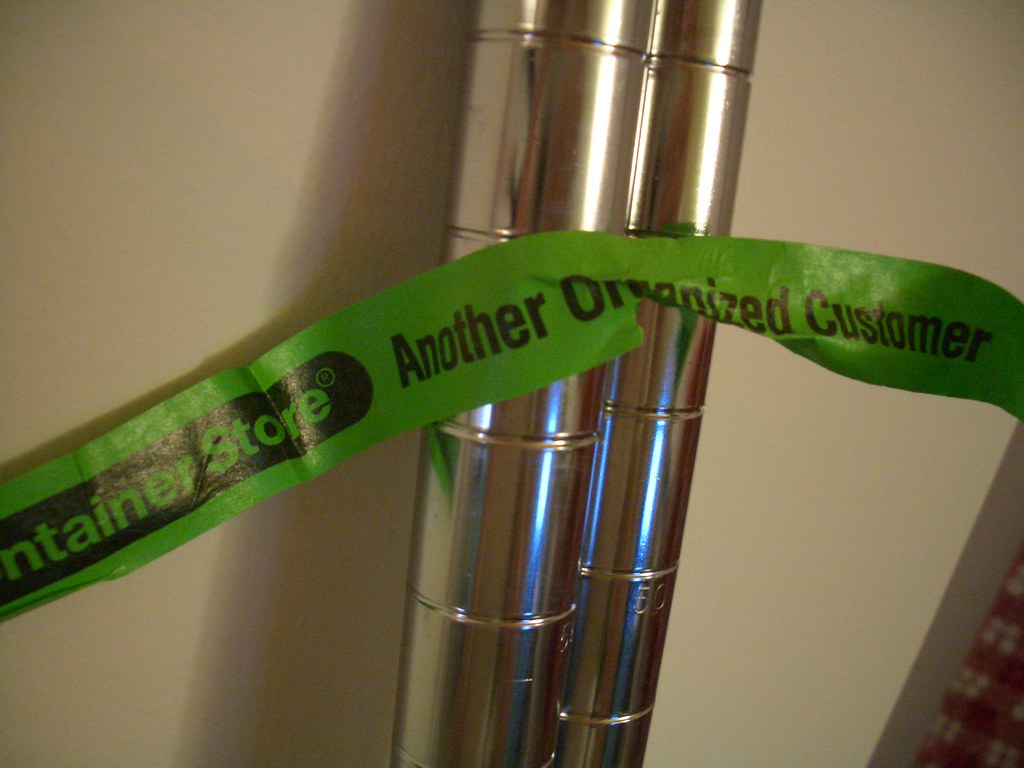
So I bought some Metro shelves at The Container Store. When I went to assemble them, I noticed a little green sticker holding them together. In between logos of the store were the words "Another Organized Customer."

This is a really cheap, functional and extendable way to talk to your shoppers. How much do stickers cost? Negligible. What do they do? They hold your stuff together. Especially big metal poles and other awkwardness. How can they be extended? This sticker could go on shopping bags, catalogs, home delivery boxes, gift wrap, small children, etc.

The sticker connects with the customer because it labels you as "organized." Presumably, you go to The Container Store to either a) fuel your existing obsession with organization or b) attempt to bring some semblance of organization to your totally chaotic home/office/life. By literally labeling you as an organized customer, you are being brought into the fold. You are wearing that label loud and proud. You Are Organized.

I also like the word "Another." It's kinda like those ads - "Secret #24: Sometimes I fake an accent at parties" - you feel like there are at least 23 other Secrets. Here, the word "Another" makes you feel like you aren't alone - there are tons of organized customers, and you are yet another of the already-overflowing pool of organized people in your town.

I say good job, Container Store. Lots of retailers use stickers and other such cheap brand-extenders, but you went one baby step beyond.

12.21.2005

Immersive retail

I was in New York recently for a conference. It was called TREX: Total Retail Experience. We listened to lectures, walked the slightly scary floor of the trade show, and toured some flagship stores in Times Square and Midtown. Good job, retail industry, for pulling off this ambitious event right in the middle of the holiday season.

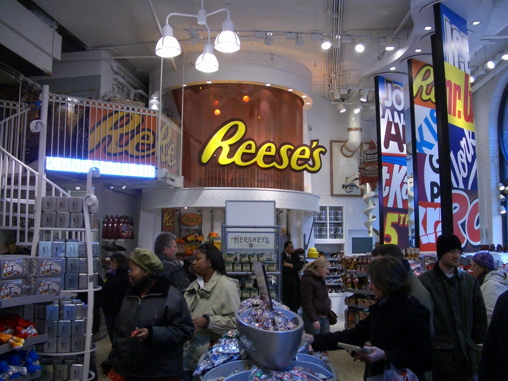
But after watching presentations about "immersive retail experiences" and undergoing severe sensory overload in stores like Toys 'R Us and the Hershey Store, I needed a serious change of pace.

I started walking around the city, reflecting on my trip and my industry. What is retail, really? It's not entertainment, and it's not education. It's not a giant staged production with lights and costumes and props. At its essence, retail is just people selling things to other people.

In the olden days, the people who sold were the same as the people who made. The potter could sell his pots with genuine enthusiasm because he made them yesterday. Can you imagine how strange it would be if you walked into Urban Outfitters, and the salesgirl said "Yeah, those buttons came from mother-of-pearl that I gathered on the beach last week. Sewing them onto the shirt was a real bitch."

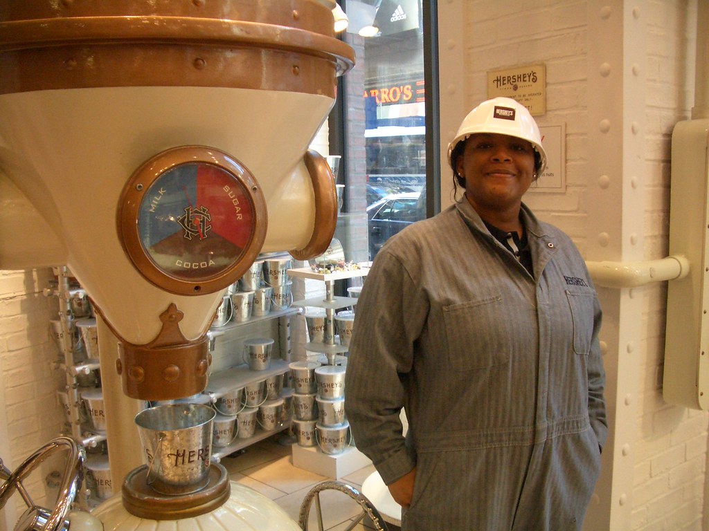
This is ridiculous. The people who work in stores have no ownership. How can you blame them? This Hershey "factory worker" is not actually making candy by turning a crank! Yet she has to dress up like a Doozer, poor thing.

So I'm still walking, thinking about how far retail has come from its humble beginnings, when I happen upon a street fair. Walking past booths, I notice how eager the merchants are to show you their stuff. Sure, these people need your business more than Urban Outfitters does. But there's also a genuine desire to engage people, share your latest creations and hopefully receive the ultimate compliment - a purchase.


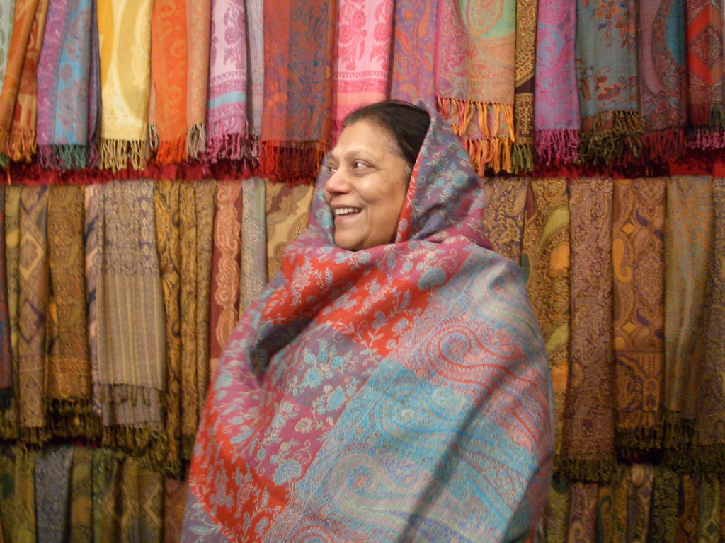
There was one booth that was full of shawls. Floor to ceiling. The woman sitting at the table looked lonely. As I approached her, she jumped up and started putting on a shawl - presumably to show me how it looked. It was the most genuine expression of salesmanship I have ever encountered. I wanted to buy a shawl from this woman, I really did.

The photo that turned out speaks volumes. Whether she made the shawls or not, this woman clearly loves them. So much that she literally immerses herself in them. She takes full ownership of her product, and it's inspiring.

Retail can be "immersive" in the sense that the store immerses the customer. Stores surround customers with their version of the world, and employees are left to simply play along. I saw this a lot on the TREX trip, and it's getting old.

Instead, retail can be "immersive" in the sense that employees are immersed in the products. They use them, wear them, eat them, like them and care about them. This type of immersion is a lot less tangible, a lot more difficult and lot more rewarding for the shopper.

So retailers: instead of paying the next design firm to put a giant brontosaurus in your toy department, go out and hire a dinosaur fanatic. It'll be worth it, I promise.

10.23.2005

Micro-cross-promotion

So there's this basic retail strategy called cross-promotion: use one item to sell another item. The classic example is a sign next to the chips: "Have a Coke with your chips!" Sometimes they even put a rack of Coke next to the chips. Sometimes, they even design a fixture that holds both Coke and chips. So we've got cross-promotion through signage, through proximity or through physical merchandising. All valid, all done a million times.

But what I saw in Dominick's the other day goes beyond any cross-promo scheme I've ever seen. It was on a micro scale. Heinz is using its actual ketchup labels to sell Ore-Ida french fries.

As I walk by the ketchup section, the Heinz bottles immediately catch my eye. On each bottle, where it usually says "Tomato Ketchup," it now says things about fries. Each one is funny, and each one is different. It says things like "What all the Ore-Ida fries are wearing" and "10 billion Ore-Ida fries can't be wrong." I also liked this one.

This is pretty exciting, because it takes in-store ads one step farther. The ketchup bottle is talking to me. And in a voice filled with personality, it's saying "Walk three aisles over to the frozen potatoes, and buy me a bag of fries." It made me aware of my location in the store, and what it would take to go get fries. I felt like the ketchup and the fries were friends! Like they wanted to be together! Powerful stuff, people.

Most interestingly, it made me consider the voice. I usually see signs in the voice of the store. If Dominick's wants to tell me "This pasta is half off," I'll listen. I trust the grocery store when it tells me about price. I trust the grocery store less, however, when it tells me about food. When Dominick's is like "Our fish is fresh!" I think, "Hmm. Really? Define fresh."

But when I see things in the voice of the product, which is much less often, I think I trust it more. Maybe because this is a new frontier, and it hasn't been exploited to death. But Heinz owns Ore-Ida (which I just discovered) and it's a really interesting way for that parent company to cross-promote its own products. Why rely on Dominick's to do that for them?

And there are so many huge companies that own tons of brands. Procter & Gamble could go nuts in this area - Tide could sell Febreze, for example. If the store told me to buy Febreze with my Tide, I might not listen. But if Tide told me - well, I trust Tide from 62 years of product history. Tide knows what it's talking about!

You know what would really be cool? If I went over to the Ore-Ida section and their bag said "Did you bring the Heinz ketchup?"

10.02.2005

Displaying your customers

We all know that Apple does it right. Everything they touch these days, from products to services to software to ads, turns to gold.

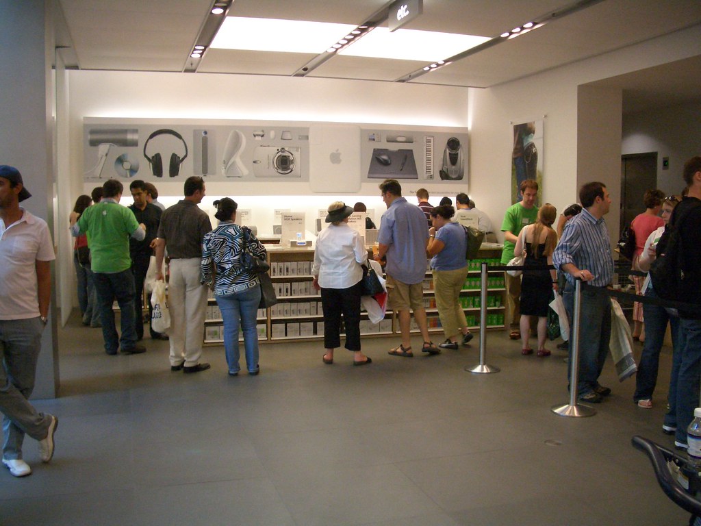
And their stores are no different. Each element is thoughtfully designed with the others in mind - lighting works with sound works with staff works with product works with layout works with displays. It's a gorgeous orchestration of a whole bunch of variables.

When I was last in the Apple store, I noticed something particularly extraordinary about my surroundings. All the people looked great. Seriously! They didn't become good-looking or well-dressed, and many certainly still had that Midwestern Tourist thang going. But yet, each person looked more alive, more colorful. If I had to picture the "typical Apple user," suddenly they seemed to be all around me. In fact, I seemed to be one too!

I feel that the store's color palette is serving this exact purpose. It's mostly white and gray, but for a few bursts of color on certain highlighted products. The real colors that stand out - besides the startlingly bright blue screens on the iMacs - are the colors of the people. Their clothes, their shopping bags, their hair and skin. People in this store look switched-on. Like they're looking to the future, the next big gadget that's going to rock their commute or drive their business plan. They actually look like Apple users, the minute they step into this space.

They say that space can make people behave in new ways. Like the romantic candlelit restaurant that prompts you to tell your boyfriend you love him. Or the open field that inspires you to run and do cartwheels. Or the office cubicle that makes you lower your voice and develop bad posture.

If your environment can change your behavior, Apple has mastered this technique. They have designed stores that act as a template, a backdrop for people to look and feel cool. The shoppers that surround you are on display; they look brighter, smarter and more alive. They make you want to join them. And how do you join them?

Chances are, you join them by buying an iPod.

8.11.2005

Show and tell

Six Flags Great America is your average crazy theme park. You wait in long lines (~45 min) for really fast rides (~60 mph) that are over before you know it (~45 sec). Each ride has a theme, and the theme is depicted with displays all along the waiting line.

For example, the Batman ride has a broken fire hydrant with water spraying out, a busted cop car spewing steam, an enormous black fan that blows chilling wind towards you, and dirty street signs from Gotham City. These few artifacts serve to create the general feeling that crime is running rampant and we need Batman's help. It's basically awesome.

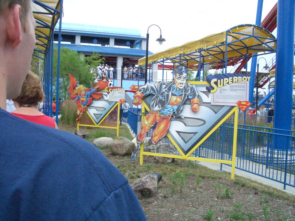
But then you get to the Superman ride. And what you've got, both to put you in the mood and to occupy your attention, is a long series of character cut-outs, each with an explanation. The intention is great - "Here you can learn every single character that ever appeared on Superman." But the execution is really poor. Tiny text. So small, you have to lean over the railing and squint. Tons of data. The character's name, special powers, weaknesses, what they wear, how they know Superman, etc. etc. etc. It's tiresome and draining, and you quickly feel impatient with the slow-moving line.

The key difference here is showing us versus telling us. In Batman, you see a few tangible objects, and your mind fills in the rest. You imagine the accident with the cop car, you picture the criminals, you feel the sewers. This is showing us, and it's very effective. It creates an experience that we can take part in.

In Superman, you are told a million fantastic facts that don't give any sort of visceral reaction. You can barely read the words. The characters quickly feel irrelevant. This is telling us, and it's information overload.

For all consumer experiences, the rule is simple. Whenever possible, show me, don't tell me.

8.04.2005

The perception of fresh

There's this restaurant called Sweet Tomatoes. Total chain, nothing hot about the design of the place. But it's a great concept, and it's generally very well done.

Think of a salad bar. What comes to mind? You may picture your last hotel's creepy restaurant, or the "special" salad bar that Wendy's used to have, or your old college dorm's cafeteria. Either way, a salad bar is a disappointment.

You think, "I can make MY salad, MY way!" Haha, wrong. The lettuce is white, the carrots are sad, and the random egg is scary. No variety, no appeal. You sit back down with your empty plate.

Now picture this. Sweet Tomatoes has a salad bar like, a block long. It includes everything you could possibly imagine on a salad. There are multiple colors of peppers, multiple sizes of tomatoes, multiple types of lettuce; there are raisins, sunflower seeds, wonton noodles and parmesan croutons; there are beets, pickles, artichokes and olives. There are four kinds of pre-made salad at the front. There is everything under the sun, and it's all fresh.

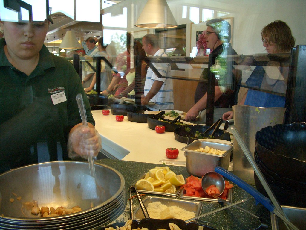
Now Sweet Tomatoes is very focused on "fresh" - every item in the bar is brightly colored, the surfaces are kept clean, and there are attendants refilling everything constantly. Even though I've never seen the place less than packed, it is always clean. But I have a small bone to pick with this freshness thing, because they are taking it a little too far.

At the entrance to the salad bar, where you pick up your plates, there is an attendant making pre-made salads. On the countertop are little tomato-shaped timers, one in front of each giant salad bowl. They look to be set for 20 minutes each. Upon a salad sitting for 20 minutes, it appears as though it will be re-made, or thrown out, or something. You think, "Sweet, I can feel confident that this salad is less than or equal to 20 minutes old!"

But wait, the timers aren't on! I picked one up, and noticed it wasn't ticking. Then I noticed none of them were ticking! I felt so completely tricked!

I think it's great when a place shows off its "freshness" and follows through on that image. And Sweet Tomatoes, for the most part, does. But I've heard a lot lately about "fresh - or the perception of fresh." Americans seem to be all about fresh these days. We want to know that everything we touch is completely virgin, just plucked off the tree not eight seconds before we arrived. But this cannot be reality, and so we are left with the "perception of fresh" everywhere we turn. Stores look fresh so their food looks fresh. Places use color and font and signage and the word "fresh" all over the place so that you feel you are getting something new, original, unique to you.

But really, when you pick up 25 apples and choose 3 in the grocery store, those other 22 apples will be bought by someone else! Now their apples aren't fresh! But do they care? Do you care that yours were probably touched too?

I think we need to stop pretending that everything is fresh. It's not. If Sweet Tomatoes were using those timers, then great. But if they're just part of an image, I think they can give it up. Consumers are a little smarter than that.

6.24.2005

Everything else

So there's this amazing little toy store in East Ukrainian Village called Rotofugi. Every item is rare, carefully chosen and displayed with delicacy. It's more like a museum than a toy store.

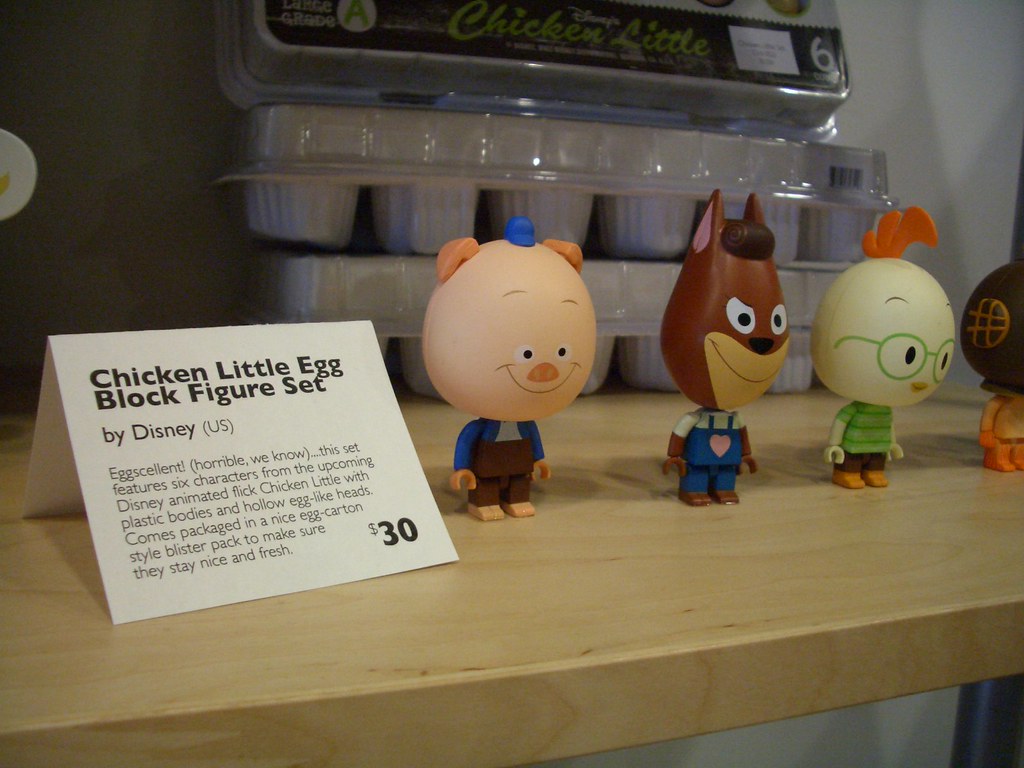
Besides just carrying cool merchandise (like Chicken Little eggs), Rotofugi does something else very well. It has a little card that accompanies each product. It says the item's name, and then the designer's name, and then a short paragraph under that, and then the price at the bottom.


These cards are absolutely consistent for each item in the store. Everything is named, the designer or company is credited, and the descriptive paragraph shows some of the store's character by using an informal, first-person voice. The cards are well-organized, provide useful information, bring us closer to the designer and reveal the store's personality. They are uniquely Rotofugi.

At a time when retailers are trying desperately to distinguish themselves as unique, this small card actually accomplishes a lot towards that goal. There are essentially two ways a store can stand out from the crowd: 1) the products it sells, and 2) everything else. By "everything else," I mean the signage, the displays, the fixtures, the logos, the employee uniforms, the sale signs, the coupons. Because think about it: the product maker owns the products, but the retailer owns "everything else."

So in grocery stores, Jewel and Dominick's and Shaw's and Food Lion and Publix all carry essentially the same products - groceries - and so they try to distinguish themselves with unique, brand-consistent signs and uniforms and art and displays. This is hard, and takes lots of money. So it generally manifests in things like Jewel's "Sale" signs and Food Lion's "Milk and eggs" signs. Do these things distinguish them from the other grocers? Eh. Not really.

But something as small as a well-designed, carefully-written card can bring the shopper so much closer to the retailer, because it actually feels unique to that store. It IS unique to that store.

I'm not suggesting that Jewel get out the quill pens and creative-writing teams. But I am suggesting that Jewel show more things that are uniquely Jewel. Instead of simply thinking its Fresh! signs are better than the Dominick's Fresh! signs, perhaps Jewel should look outside its industry, take a walk down the street, and check out what the local toy store is doing.

6.12.2005

Would you like dollars back?

So my boyfriend goes into CVS to pick up some Claritin. The cashier asks, "Would you like cash back?" This is generally an easy way to grab $20 without hitting up an ATM. So he says, "Sure, how much can I get?" She says, "Thirty-five dollars." He hits 3 - 5 and OK. The total sale on the register changes from $19.01 to $19.36. She hands him a quarter and a dime.

Did you get that?

WHO WANTS THIRTY-FIVE CENTS? Who would ever request coins as part of their "cash back"? No ATM can ever give you dollars and cents. They don't even ask you to fill in the .00 part. Why would a credit-and-debit-card-reading machine require you to fill in the cents column?

I wonder how often this happens.

6.09.2005

Where do I pay?

So I go into FedEx Kinko's, as I usually do, with a very minor task. Today I had to send a fax. The store has signs, employees and office equipment scattered throughout every inch of the space. You would think I could send a fax and be on my merry way?

Haha. I could spend hours railing on the retail outlets of FedEx Kinko's, especially after the merger. But for now I'd like to call attention to an overarching principle they seem to have missed. It's called Hierarchy.

Hierarchy means you pick the most important thing, and it gets the most attention. The second most important thing? The second most attention. And so on. Instead, there are signs throughout the store - some hanging, some resting on surfaces, some posted on walls. Some big, some small. Some relate to entire regions of the store, some refer to just one product. I saw "Office Services" right next to "Colored Paper." These elements are not at the same level in the hierarchy, guys! They should not have the same size sign! I wonder how many people come in for Office Services, versus how many come in for Colored Paper. Hmm. This is an easy way to figure out which signs should be big and which should be small.

Now I would imagine the top level in the hierarchy to be the checkout - it probably gets the most traffic, right? I mean, no matter what service you've come there for, everybody has to pay. I asked an employee "So where do I pay?" He points, "Oh, at the cashier." I turn. It's a big square counter with one woman inside. She's helping some guy figure out how to fax to an international number. One girl is waiting. You would never know this is the cashier. There is no sign.

Let me repeat: there is no sign! Nothing that says Cashier or Check Out Here or Give Us Your Money At This Place. People could miss it and just walk out! I almost forgot I even needed to pay! With signs everywhere, you would think they could make a sign for the cashier! This is Kinko's, they could even make the sign right here in their store!

FedEx Kinko's has enough confusion to deal with, now that they provide every single service that might possibly relate to paper. The least they could do is make sure all their customers are stopping at the cashier. I'm sure the folks at corporate agree that it's a pretty important part of their hierarchy.

6.05.2005

You can almost imagine it

This Container Store closet is stocked full of real-life clothes on real-life hangers. You stand within the three walls and can almost pretend you're in your own enormous walk-in closet full of color-coordinated shirts. This is great because it's so aspirational: people go "My life would be better with this closet." But it also made me think, "Yeah, right, like my closet would ever be this neat." It's a fine line, aspirational versus totally unrealistic. Maybe they could throw a few t-shirts on the floor.