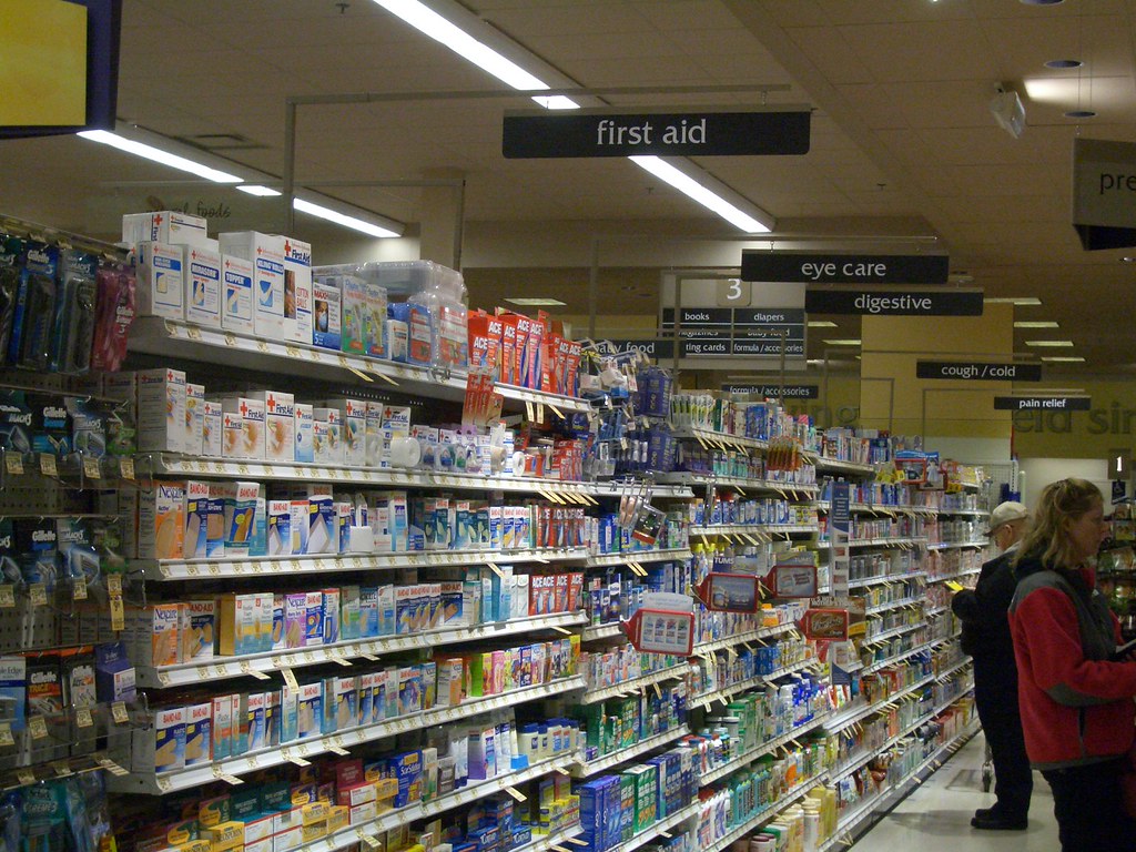
 There's a lot of talk around the idea of "cross merchandising" at my job. Most brand marketers seem to be entirely for it, while most retail buyers are vehemently against it. As designers and consultants, we need to see both sides. But it's an endless debate and so I'd like to play it out here.
The basic premise is this: I am a brand company, and I sell cookies. I do not sell milk. However, I like it when milk is sold next to my cookies, because people buy more milk, and people buy more cookies. (As I understand it, this has been proven to boost sales in many, many retail situations. Cellphones with headsets, popcorn with movie rentals, chips with salsa, sweaters with matching skirts).
But now instead, pretend I am a store. I sell everything. Milk, cookies, Kleenex, hamburger buns, carrots. I want to make it easy for people to shop. If I move the milk, and put it next to the cookies, people will go to the dairy case and, seeing no milk, will be confused. They will back away slowly. They will flock to my competitors. They will never think to go look by the cookies.
Likewise, if I sell Kleenex next to the cold medicine, instead of in the paper aisle; if I sell hamburger buns by the meat, instead of the bread aisle; if I sell carrots with the ranch dressing, instead of with the produce; I am creating chaos.
So why can't we just put MORE Kleenex next to the cold medicine? Keep the MAIN Kleenex stock in the paper aisle, but add a couple boxes next to the NyQuil? Surely those boxes will fly off the shelves!
(And they will, too. People don't realize how suggestible they are, but if you are buying NyQuil, you see the Kleenex boxes and go "Oh yeah! I totally forgot, I totally need Kleenex." And you totally buy some. And that adds up for a retailer).
But suddenly, we are moving towards a scary store of the future. Everything is everywhere. Carrots are in the salad dressing aisle, along with lettuce, croutons and dinner rolls. It barely looks like a salad dressing aisle anymore! The milk is by the cookies, the chocolate candy, the cake mixes and the peanut butter! What kind of crazy store is this?
So here's what I'd suggest, if I were designing the store of the future. People have two very different needs in a grocery store. Number One: Find what I am looking for. You'd think this was easy but good god, it's not! Have you ever tried to find horseradish in a Dominick's? It's a nightmare! And Number Two: Give me ideas. What time do you usually figure out what to cook for dinner tonight? Maybe five minutes before you start cooking? You look in your fridge, you peer in your cupboard, and you think, "I have no idea what to make."
So here's how my store would go. There are two very different sides. The first side is Easy to Find Land. There is no cross-merchandising, no shelf extenders, no aisle violators, no signs sticking out into the aisle, suggesting that you try some chips with your salsa. Its aisles are uncluttered, there are fewer products, and I can see where everything is.
The second side is Suggestion Land. It is comprised of displays with recipes and the ingredients needed to make them. You have the recipe for Chicken Marsala, and right there, underneath the tear-off recipe card, are chicken breasts, sage, heavy cream, Marsala wine, lemon juice and shallots. Next to it is the Spaghetti recipe, with pasta, marinara sauce, parmesan cheese and mushrooms. Next to that is the Milk And Cookies display and the Carrots And Ranch display. Maybe these displays are arranged according to meal: Breakfast, Lunch, Dinner and Snacks. Maybe they are arranged according to prep time: 5-15 minutes, 15-30 minutes, 30 minutes and up. Suggestion Land is a walk-in cookbook.
Sometimes I'm in the mood to find what I need and get out, because people are coming over to my house and the store employees have all disappeared and I can't find the ginger dressing! Aah! In this case, please give me Easy to Find Land. I will be happy and loyal.
But sometimes, I have an hour, I am in the right state of mind, and I want to be shown recipes and ideas. In this case, please give me Suggestion Land! I will happily and easily change my mental model, because I understand that it's a different space and products are sold differently there. It's not that big a leap.
Grocery stores today are a total mishmosh. It's ridiculous. They are trying to solve both these needs - finding planned purchases and discovering new items - in simultaneous spaces. It makes both harder to do.
By displaying the products according to shoppers' mindsets, the store of the future will both inspire me AND make my life easier. I hope it gets here soon.

2 comments:
Oh man. I hate grocery shopping so much. That's really all I have to say.
Nice idea. I can even see stores making use of this model with palette displays that run the center of the aisles. Each display is a complete meal with all of the main ingredients required shelved within it. The signage doesn't say anything about specifically what items are shelved there-- it says "Turkey Tetrazini" (or whatever). Shoppers can get ideas from meals by just walking the aisles!
Post a Comment