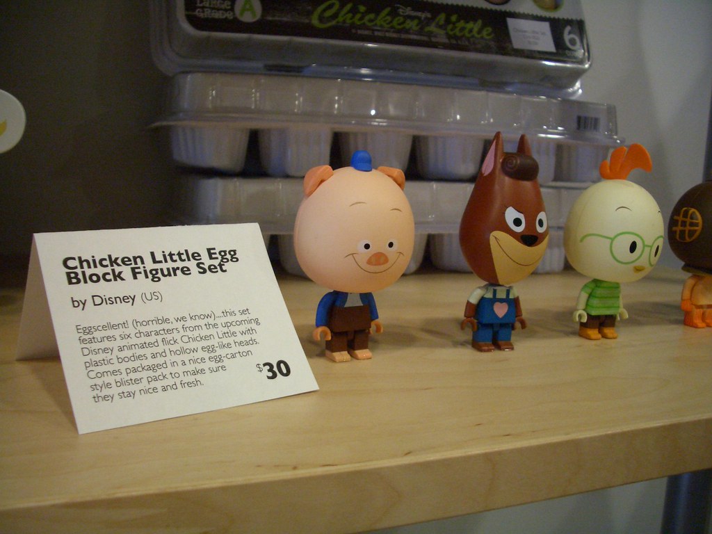
 So there's this amazing little toy store in East Ukrainian Village called Rotofugi. Every item is rare, carefully chosen and displayed with delicacy. It's more like a museum than a toy store.
Besides just carrying cool merchandise (like Chicken Little eggs), Rotofugi does something else very well. It has a little card that accompanies each product. It says the item's name, and then the designer's name, and then a short paragraph under that, and then the price at the bottom.

These cards are absolutely consistent for each item in the store. Everything is named, the designer or company is credited, and the descriptive paragraph shows some of the store's character by using an informal, first-person voice. The cards are well-organized, provide useful information, bring us closer to the designer and reveal the store's personality. They are uniquely Rotofugi.
At a time when retailers are trying desperately to distinguish themselves as unique, this small card actually accomplishes a lot towards that goal. There are essentially two ways a store can stand out from the crowd: 1) the products it sells, and 2) everything else. By "everything else," I mean the signage, the displays, the fixtures, the logos, the employee uniforms, the sale signs, the coupons. Because think about it: the product maker owns the products, but the retailer owns "everything else."
So in grocery stores, Jewel and Dominick's and Shaw's and Food Lion and Publix all carry essentially the same products - groceries - and so they try to distinguish themselves with unique, brand-consistent signs and uniforms and art and displays. This is hard, and takes lots of money. So it generally manifests in things like Jewel's "Sale" signs and Food Lion's "Milk and eggs" signs. Do these things distinguish them from the other grocers? Eh. Not really.
But something as small as a well-designed, carefully-written card can bring the shopper so much closer to the retailer, because it actually feels unique to that store. It IS unique to that store.
I'm not suggesting that Jewel get out the quill pens and creative-writing teams. But I am suggesting that Jewel show more things that are uniquely Jewel. Instead of simply thinking its Fresh! signs are better than the Dominick's Fresh! signs, perhaps Jewel should look outside its industry, take a walk down the street, and check out what the local toy store is doing.

2 comments:
That's the East (Ukrainian) Village down there... now that you're in West Town, you gotta learn a whole new set of hoods! :-)
Blush... :)
Thanks for noticing our little cards. We try to impart a little knowledge and maybe make people laugh a little, so I'm glad you liked them.
Post a Comment